Before migrating our My Holiday brand from the old website template to the current one, I was tasked to analyse the existing sites and recommend changes to improve the overall user experience. Collaborating with marketing, IT, sales, and exec teams was essential to create a functional design that met user needs while balancing business goals and requirements.
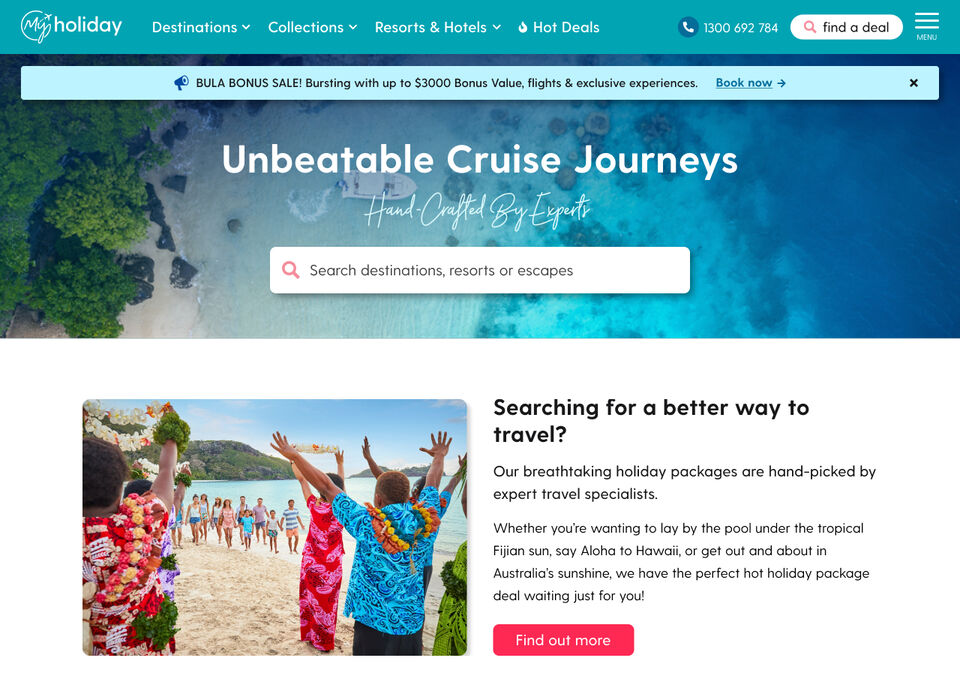
The new designs were launched in July, 2023 and saw amazing results with increases in conversions, returning users, and engagement.
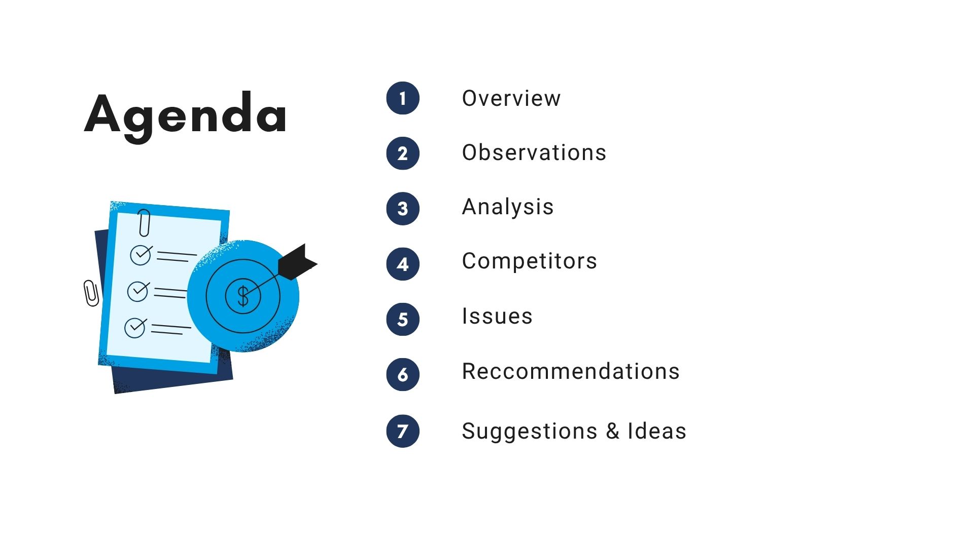
UX Tasks
analysis, research, info architecture, design
Deliverables
wireframes, mockups, prototypes, presentations
Tools
Mouseflow, Microsoft Clarity, Adobe XD, Google Analytics, Looker Studio
Analyse the current websites, referred to as our “modular” sites before migrating the My Holiday brand from the old design.
Identify issues and hurdles, recommend changes to improve user experience.
Present findings to Marketing, IT, and Exec teams, get sign off on recommendations.
Create wireframes, mock-ups, and prototypes.
Handover to dev, monitor user behaviour and analytics.
Defining the problem...
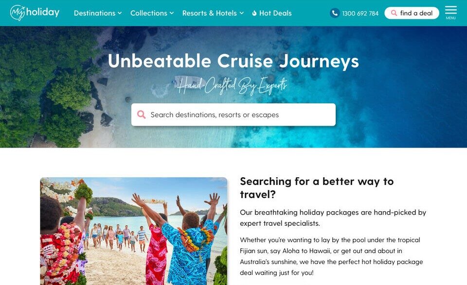
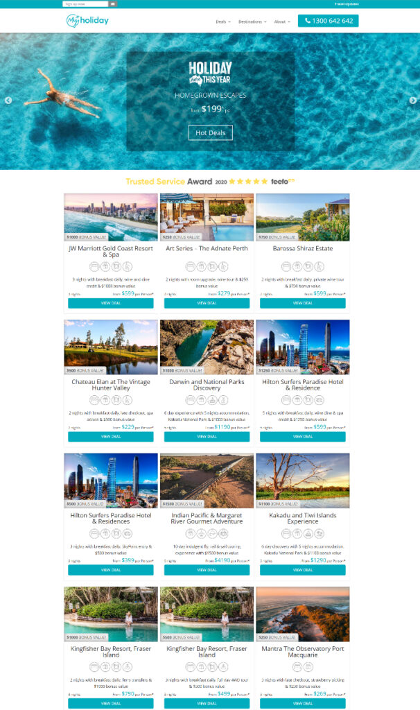
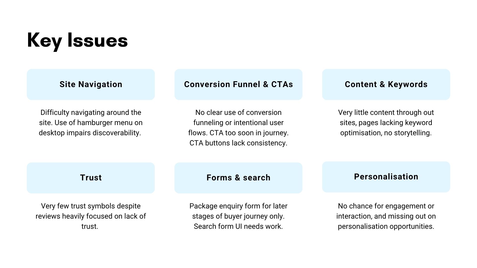
The My Holiday website’s outdated design and conversion strategy relied on print-driven traffic, limiting discoverability and user navigation. Users struggled with a lack of clear pathways, trust signals, and search functionality, leading to poor engagement and high bounce rates. Without dedicated UX expertise, the site’s design favoured business assumptions over best practices, restricting opportunities for optimisation.
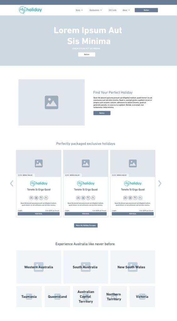
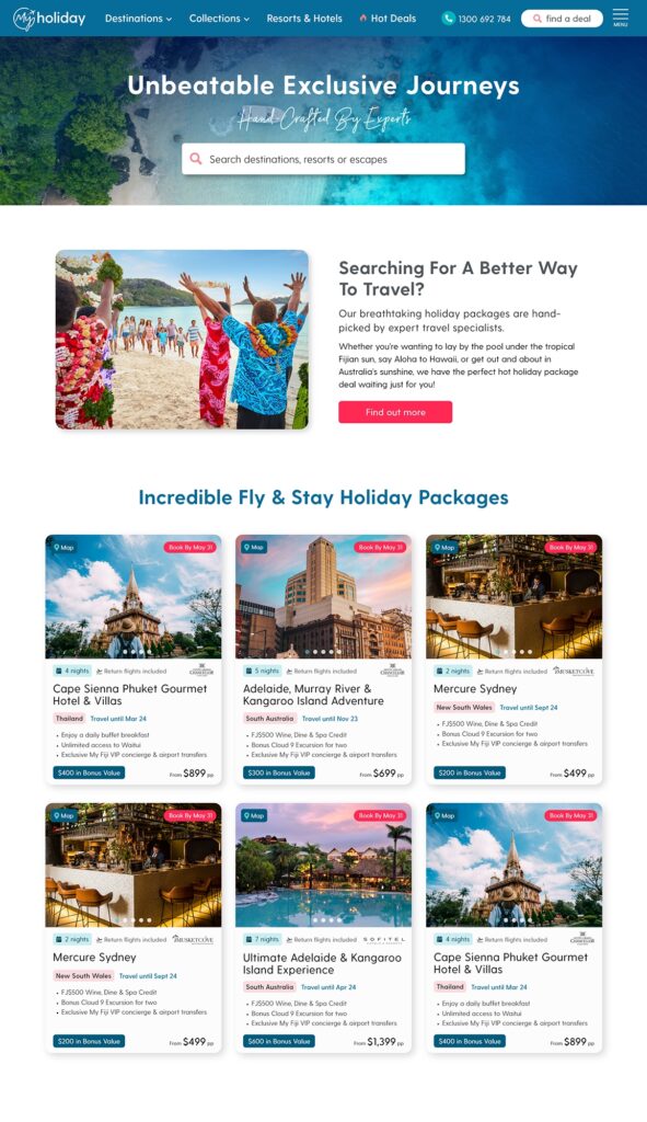
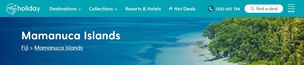
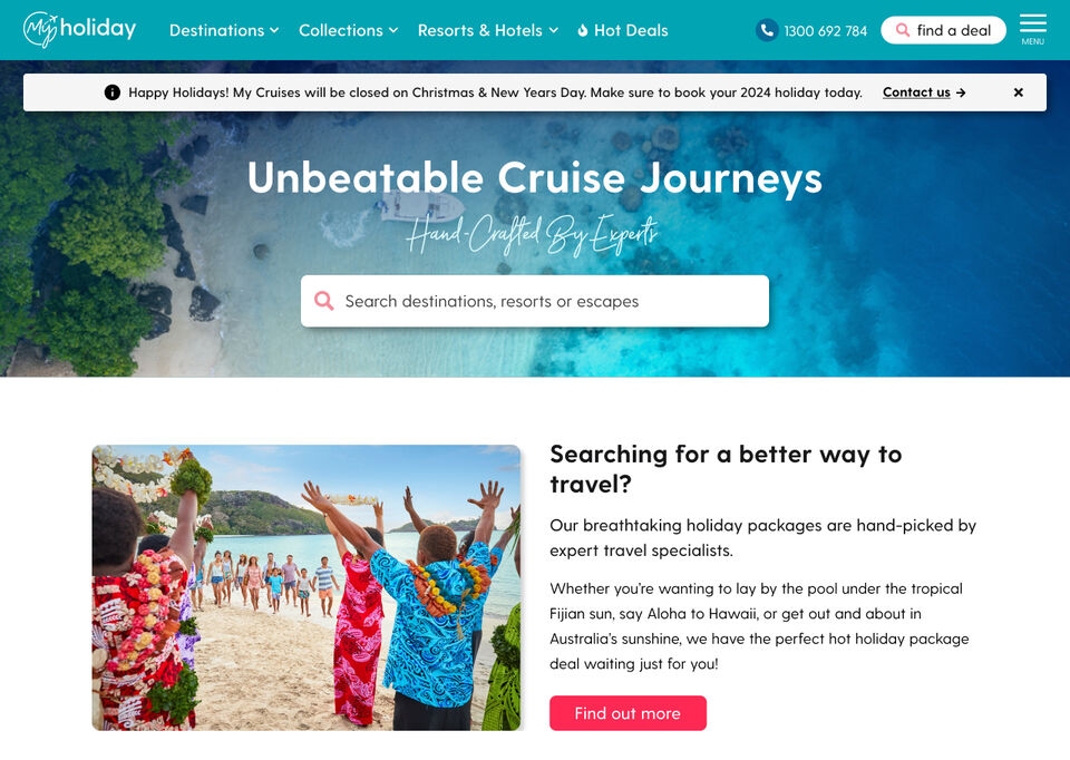
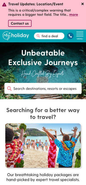
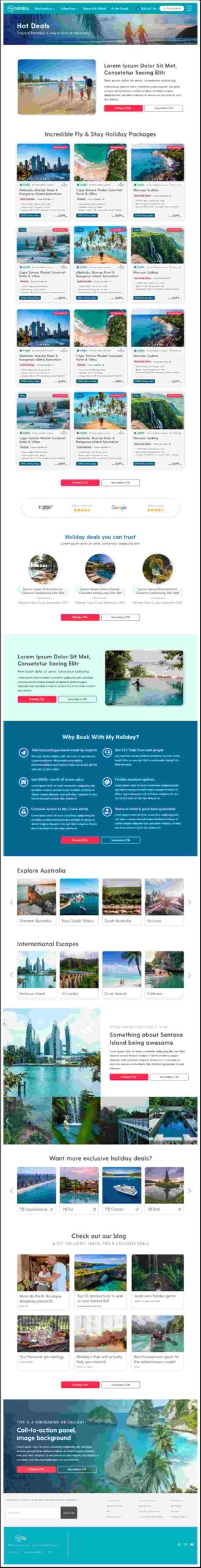
Images: Screenshots of the old website design (top left) and the current “modular” design (bottom right) that I was tasked to analyse before migration.
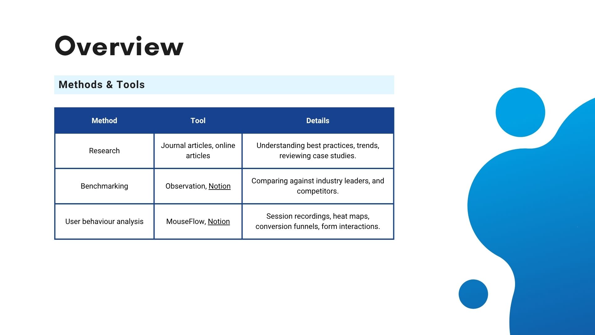
Methods
Discovery & Research
Understand business goals, industry standards, best practices, competitors and our users.
Meet with leaders from Marketing, IT, Sales, and the Executive team to determine business goals, requirements & priorities.
Learn about travel industry standards, benchmarks and relevant UX best practices for online travel agents (OTAs).
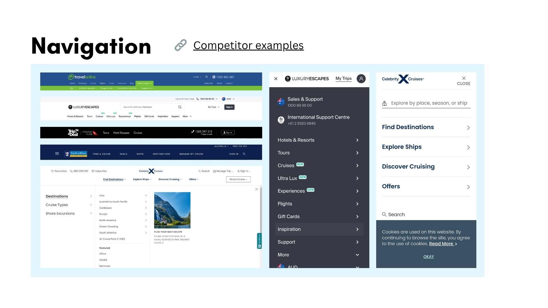
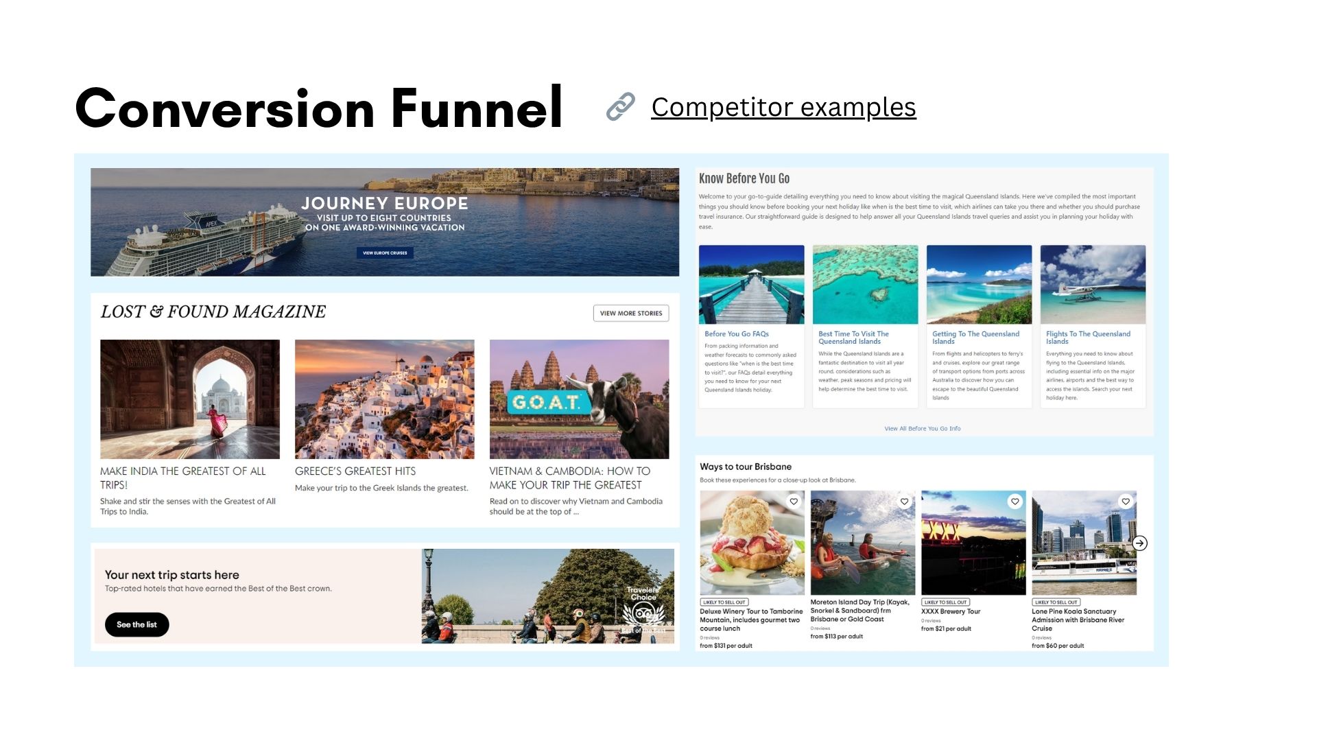
Familiarise with competitors, both direct (all-inclusive packaged holiday providers in Australia), and indirect (travel aggregators and other OTAs).
Gain an in-depth understanding of users through tracking software, Google Analytics, online reviews & feedback from enquiry forms.
Create user flows.
UX Analysis
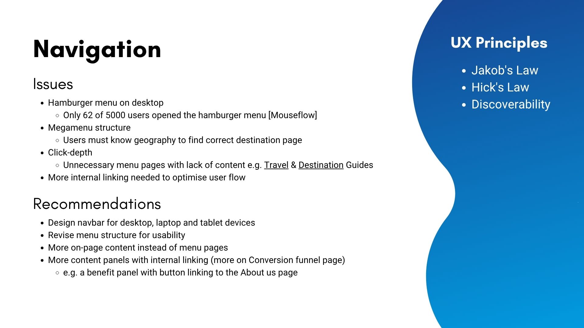
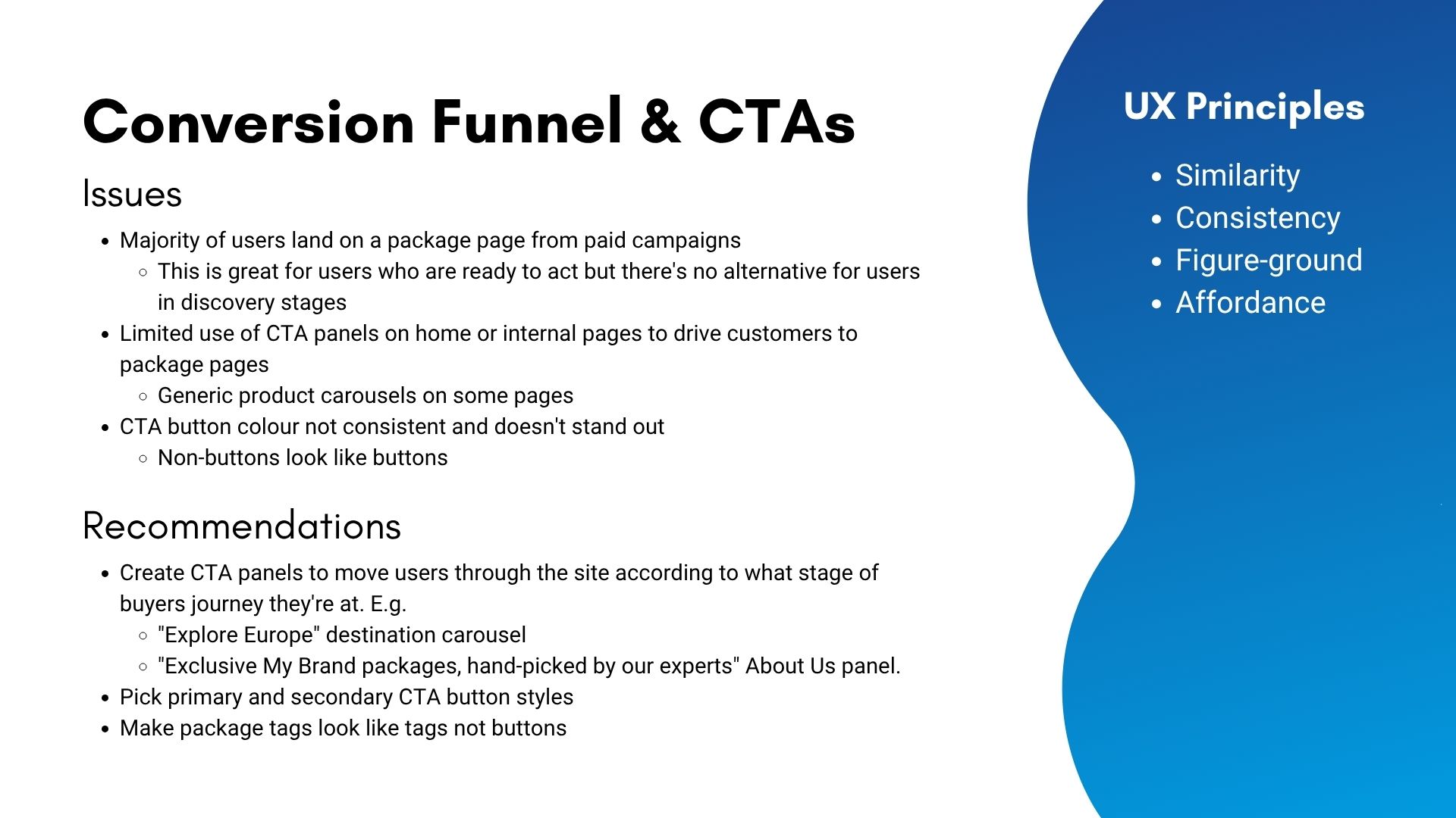
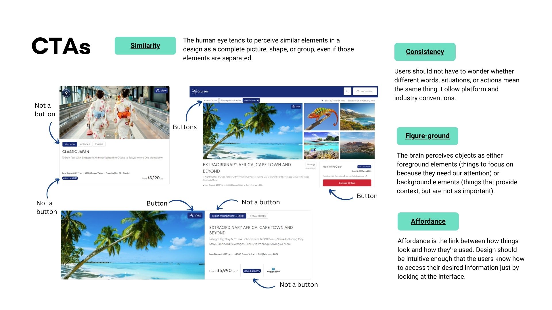
Identify issues & hurdles, what is working and what’s not.
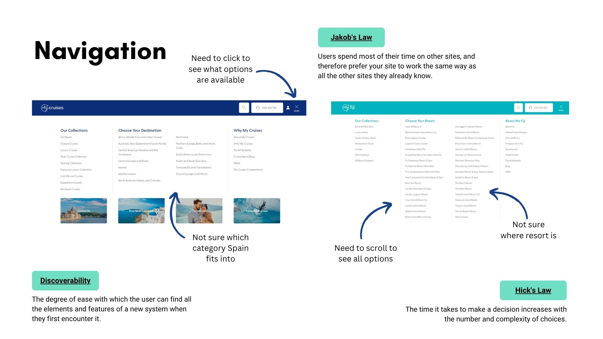
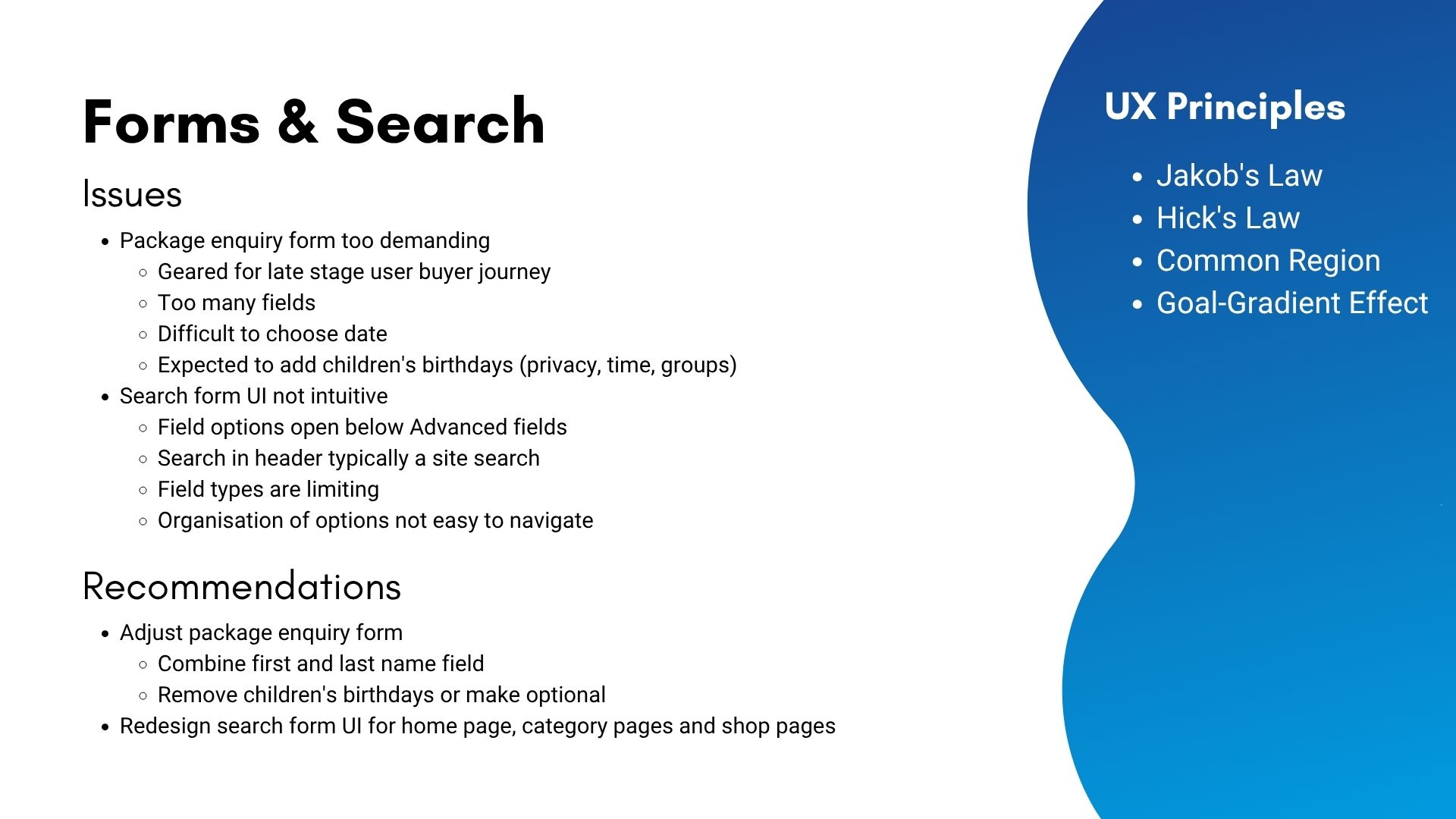
Apply heuristic evaluation informed by UX principles.
Observe user behaviour with tracking software to determine issues.
Perform a competitor analysis.
Define issues & prioritise recommendations.
Present findings to leaders from Marketing, IT, Sales, and the Executive team.
Design Process
Info-architecture, mock-ups, hi-fidelity prototypes, user testing & iterative design
Analyse & refine information architecture.
Sketch out ideas & create wireframes in Adobe XD to get feedback from relevant team leaders.
Work with marketing to determine a new colour palette that considers accessibility standards.
Mock-up approved wireframes & build hi-fidelity prototypes in XD.
Iteratively test prototypes, gather feedback, then refine designs until business goals & user needs are met.
Get approved design files ready to handover to dev.
Step 1
Discovery & Research
I began by meeting with stakeholders across Marketing, IT, Sales, and the Executive team to understand business goals, technical constraints, and team priorities. These conversations helped define success metrics and align expectations for the redesign.
Next, I researched travel industry standards, benchmarks, and UX best practices relevant to online travel agents (OTAs), focusing on how users typically search, browse, and book holiday packages.
To provide context, I reviewed both direct competitors such as other Australian all-inclusive holiday providers and indirect competitors like travel aggregators and global OTAs. This helped identify common design patterns, gaps, and opportunities for differentiation.
I also conducted in-depth user analysis using Microsoft Clarity, Google Analytics, and qualitative feedback from enquiry forms and online reviews. These insights revealed pain points in navigation, trust, and content structure.
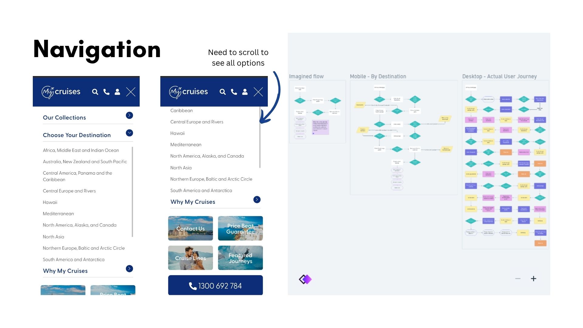
Finally, I mapped updated user flows to reflect key journeys and inform the design phase, ensuring a smoother, more intuitive experience from landing to enquiry.
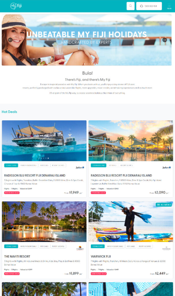
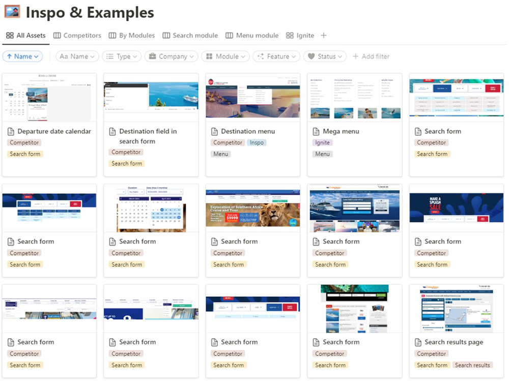
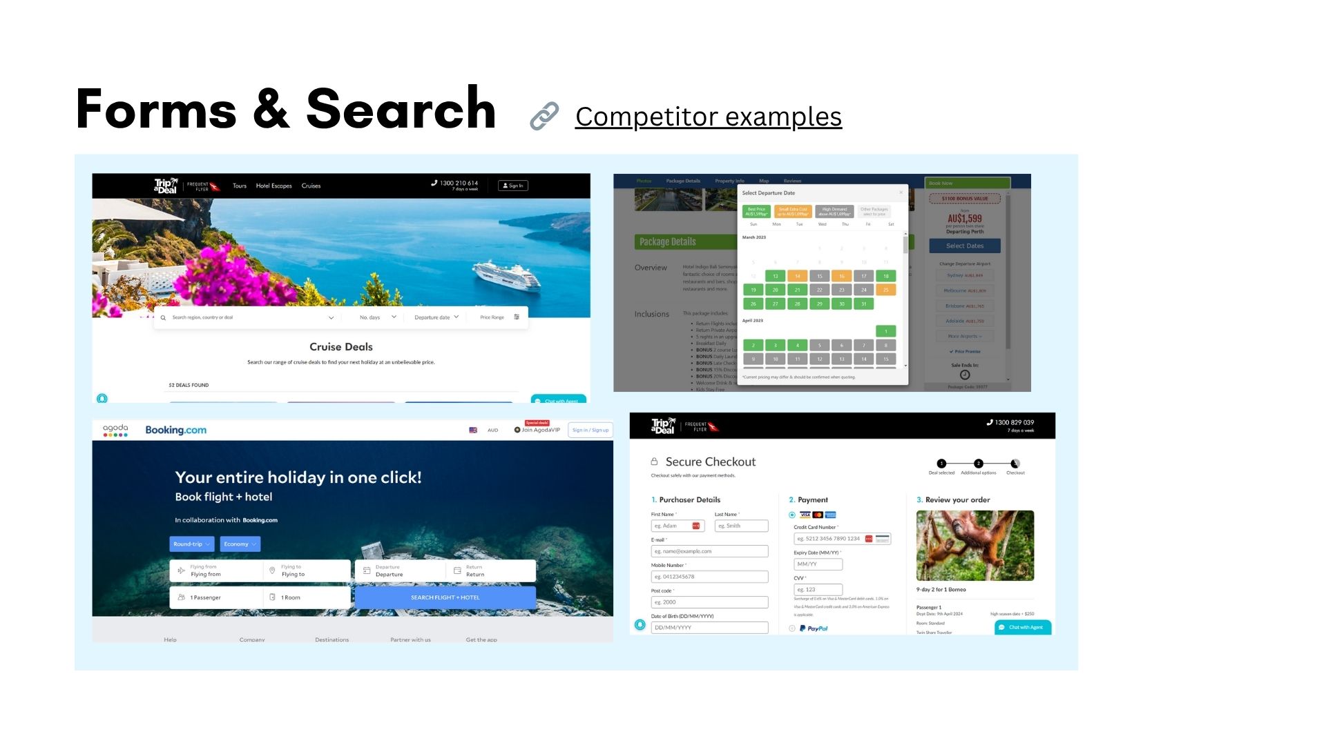
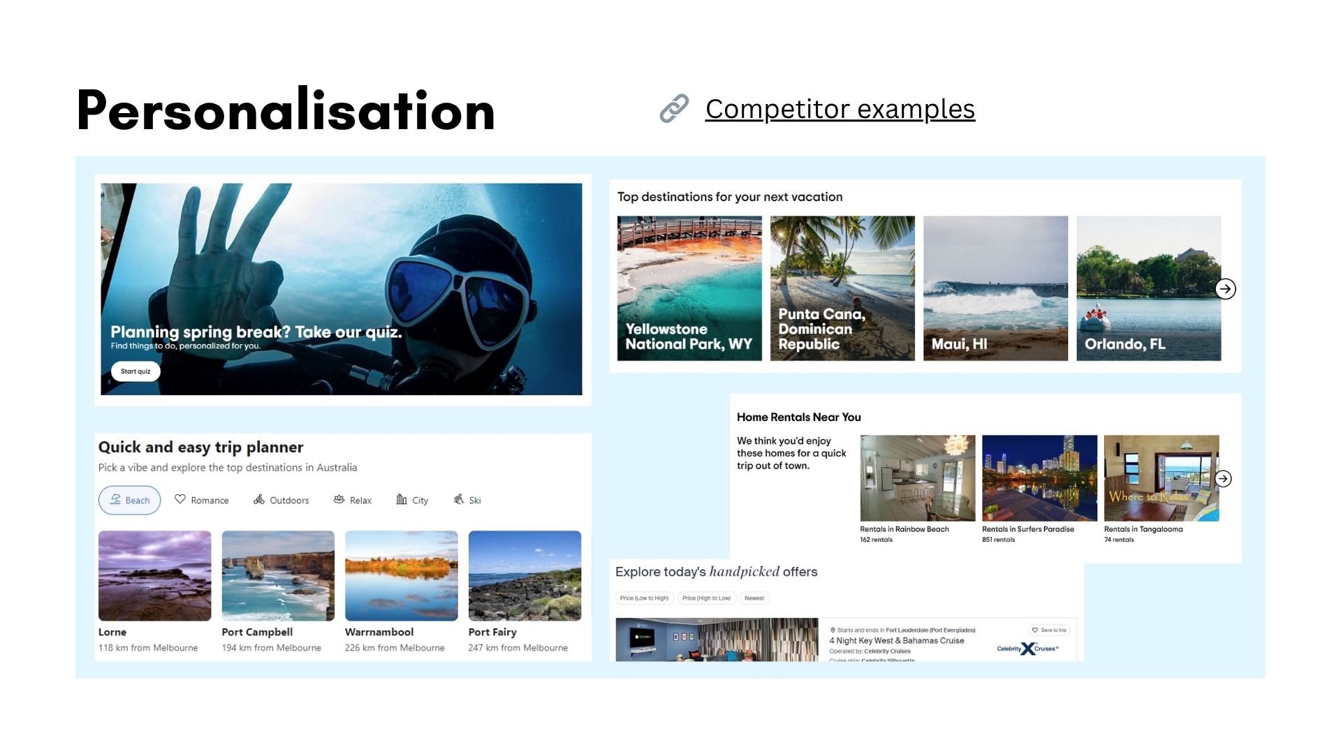
Image: Collection of screenshots from competitor websites, showcasing various features for inspiration. Organised on Notion.
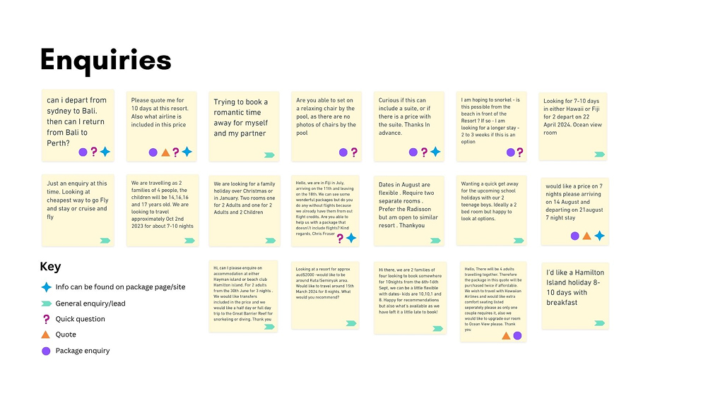
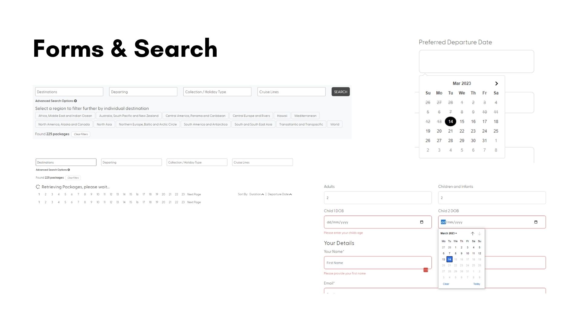
Image: Enquiry form submissions highlighting that users are struggling to find the information they need to make a purchase decision.
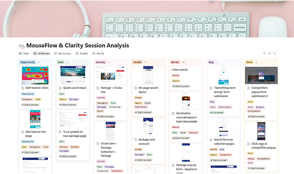
Image: User behaviour observations from MouseFlow and Microsoft Clarity (user tracking software) organised on Notion.
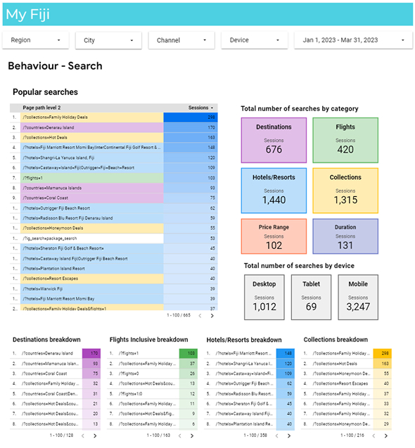
Image: Analysis of search behaviour on modular site, using Google DataStudio to create an interactive report. This was helped prioritise menu and search structure.
Step 2
UX Analysis
I conducted a heuristic evaluation of the site using established UX principles to identify usability issues, accessibility concerns, and areas where user expectations weren’t being met. This gave me a structured lens to assess the interface beyond visual design.
Alongside this, I analysed user behaviour using tracking tools such as Microsoft Clarity. Heatmaps, click data, and scroll depth revealed key friction points – particularly in navigation, search, and content engagement.
To further contextualise findings, I ran a competitor analysis comparing both direct and indirect competitors. This helped highlight where the current site was falling short and what patterns users might expect based on their experiences elsewhere.
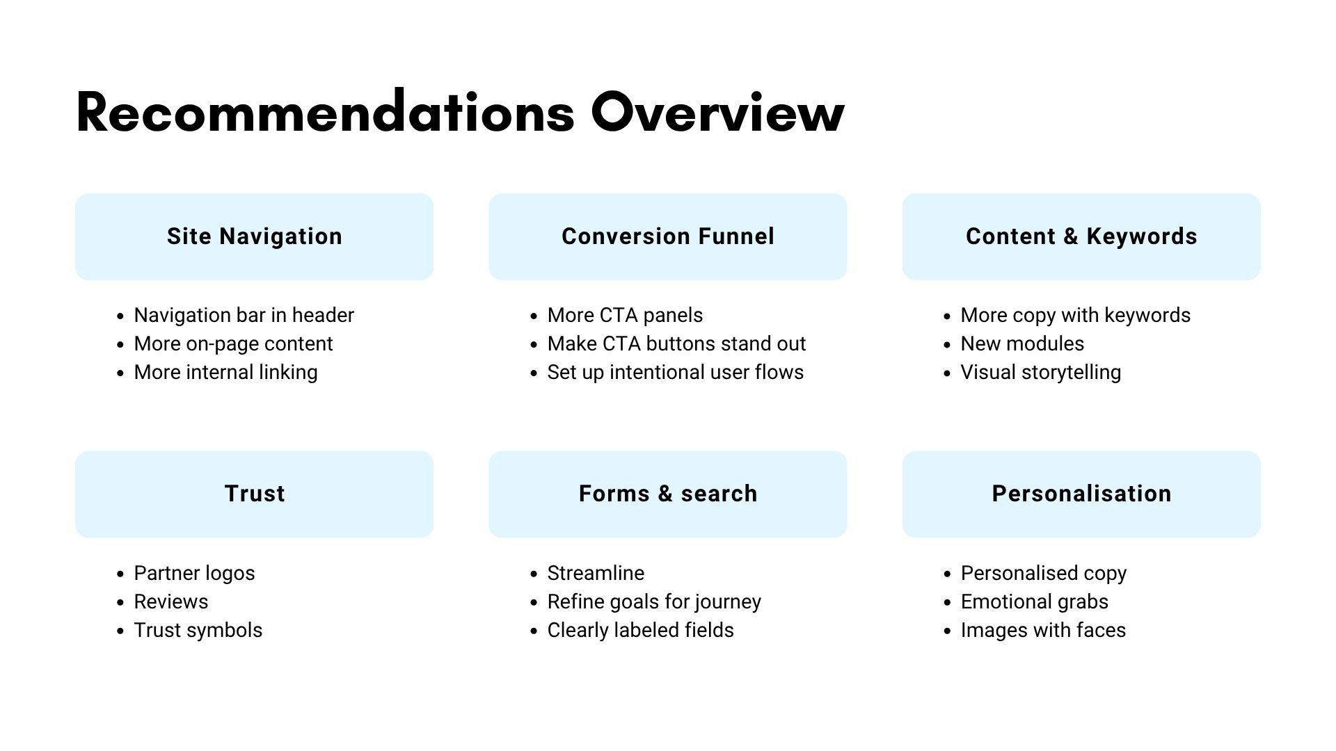
Based on these insights, I defined the most critical UX issues and prioritised recommendations according to user impact, business value, and development effort.
I then presented these findings to stakeholders across Marketing, IT, Sales, and the Executive team, framing each issue alongside supporting data and clear rationale for proposed solutions.
Presenting findings
Given this was my first major project at the company, and knowing many of the team leaders were unfamiliar with the UX design, I wanted to present my findings in an easily digestible way. I defined key issues, linked them to the relevant UX principles and highlighted competitor examples before jumping into recommendations.
With clear priorities and stakeholder alignment in place, I moved into the design phase – translating insights from research into actionable solutions. The process was highly collaborative and iterative, balancing user needs, business goals, and brand requirements across multiple design elements and page types.
Iterative design
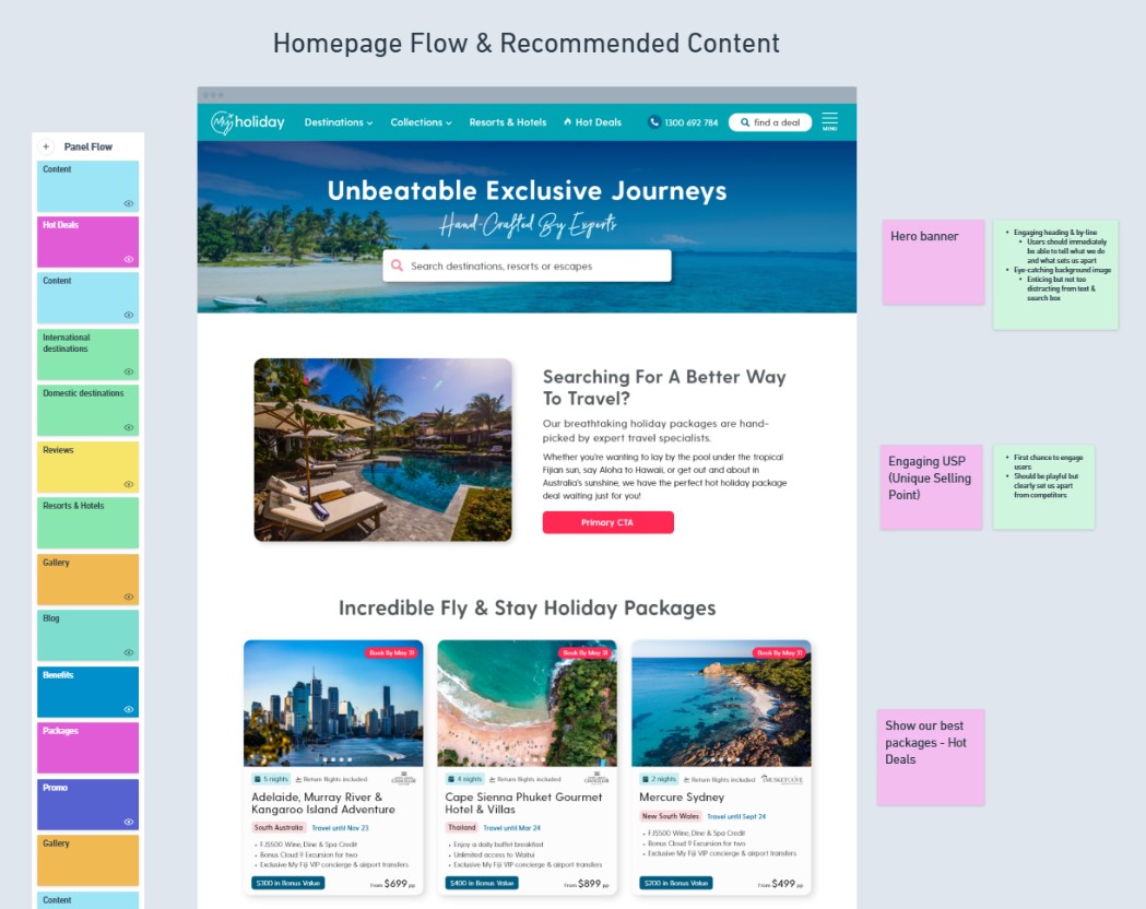
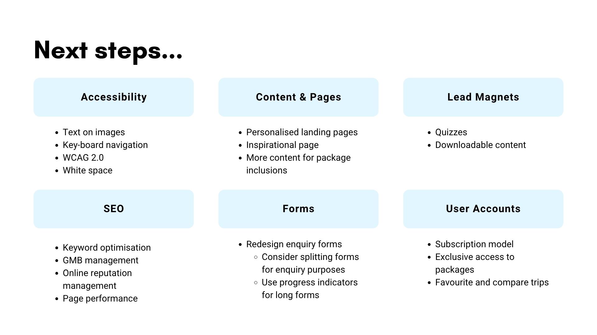
I began by analysing and refining the site’s information architecture to address gaps in navigation, search, and content hierarchy. Early ideas were sketched and translated into wireframes using Adobe XD, which I shared with relevant team leads to gather targeted feedback. From there, I worked closely with marketing to establish an updated colour palette that aligned with the brand while meeting accessibility standards. Once wireframes were approved, I created hi-fidelity prototypes and continued testing them iteratively – making refinements based on stakeholder input, usability concerns, and business goals. Finalised design files were prepared for development handover.
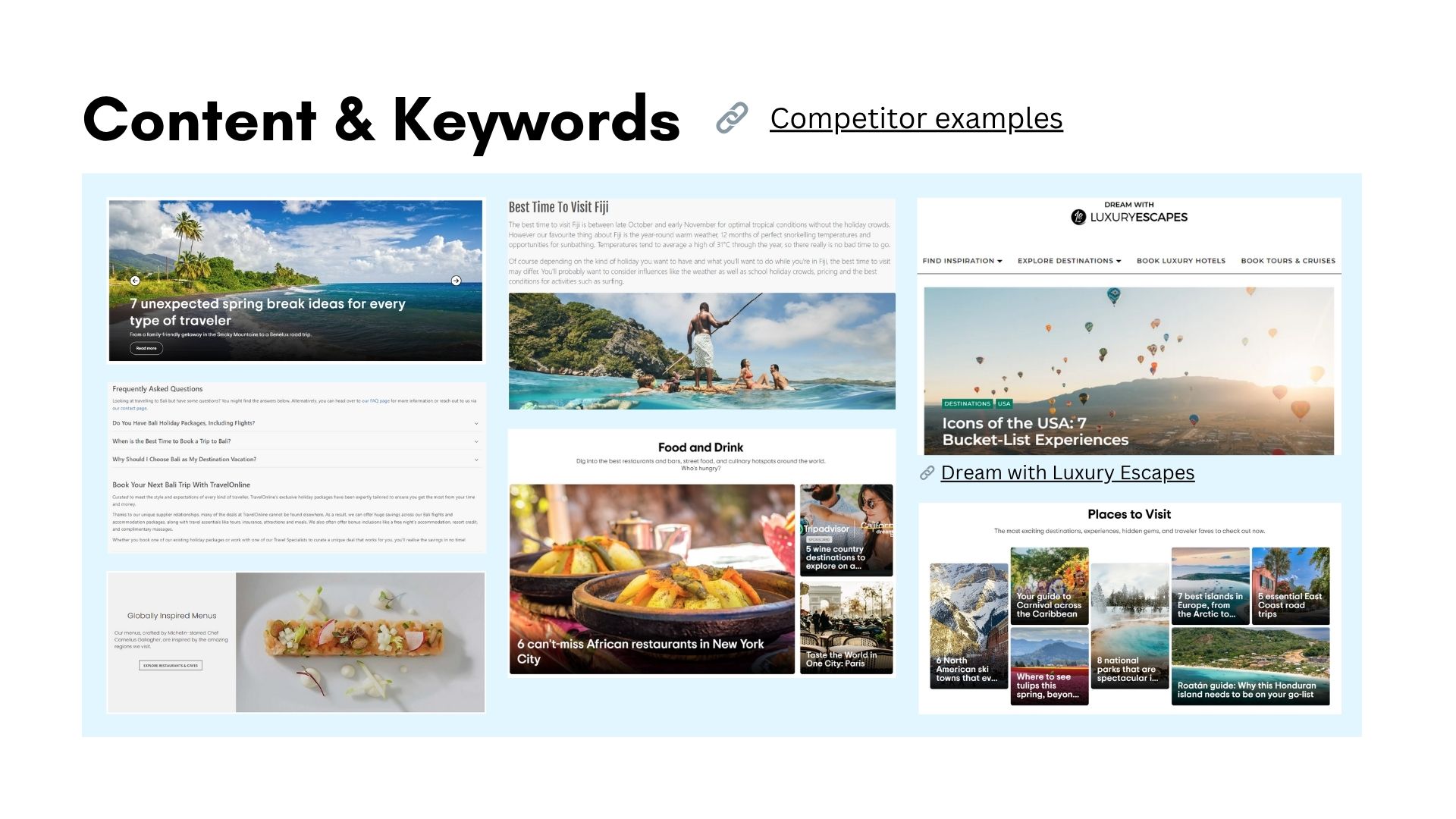
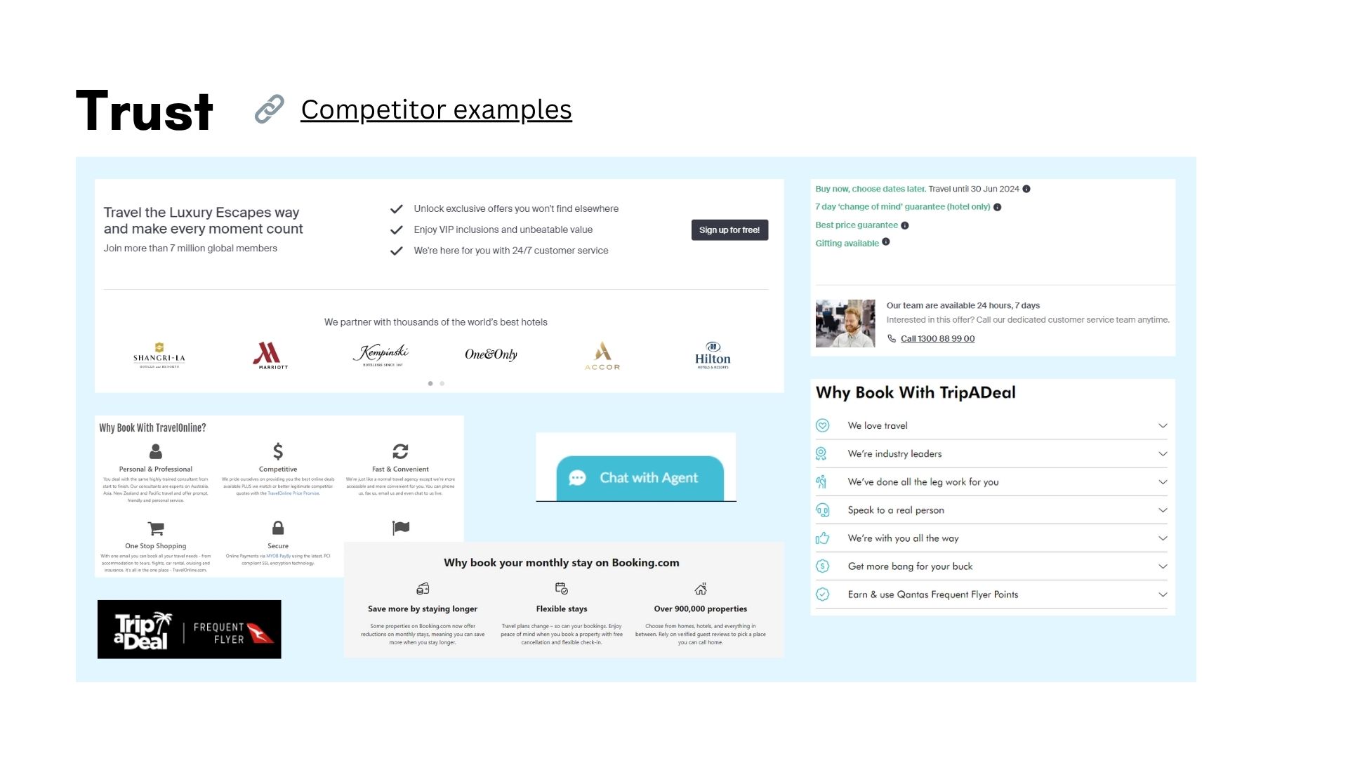
Image: Collection of screenshots from competitor websites, showcasing various features for inspiration. Organised on Notion.
Images: Collection of screenshots from competitor websites, showcasing various features for inspiration. Organised on Notion.
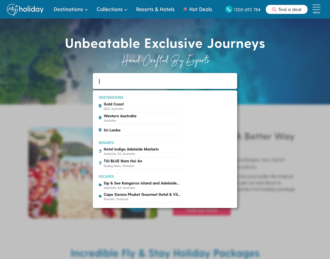
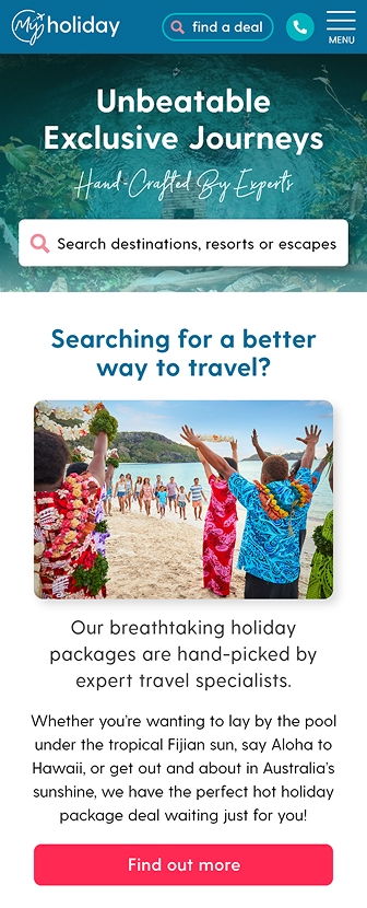
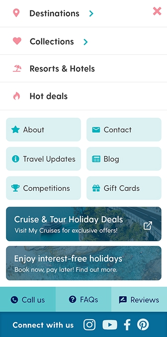
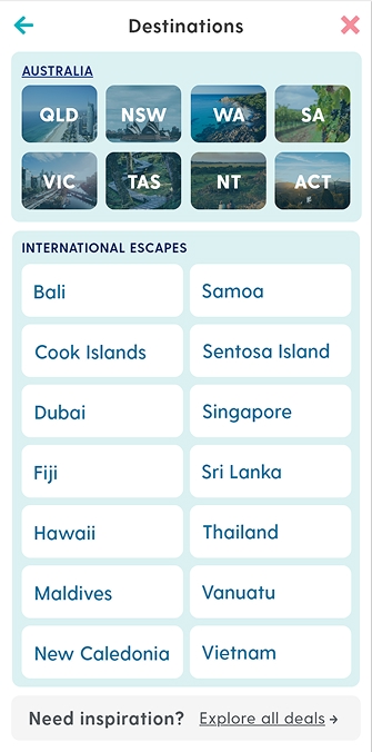
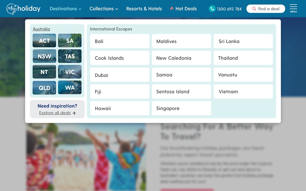
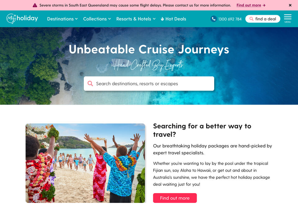
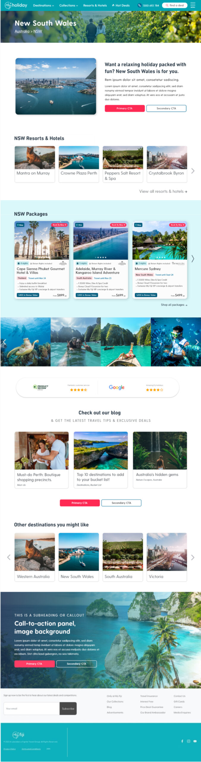
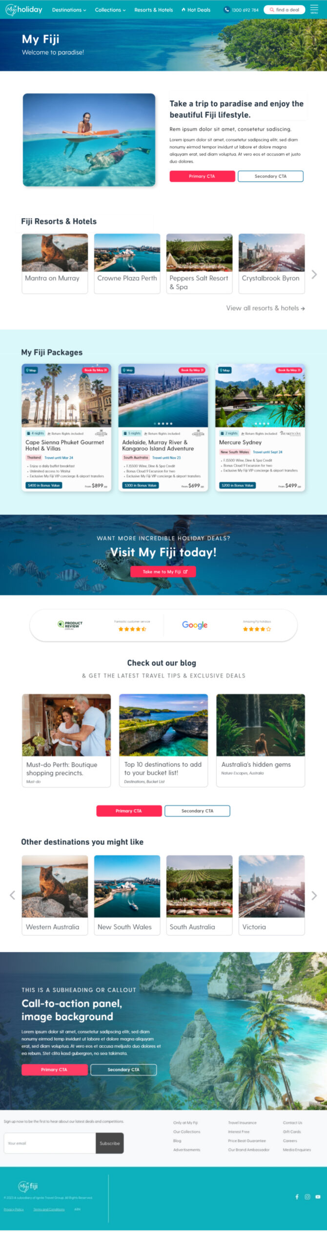
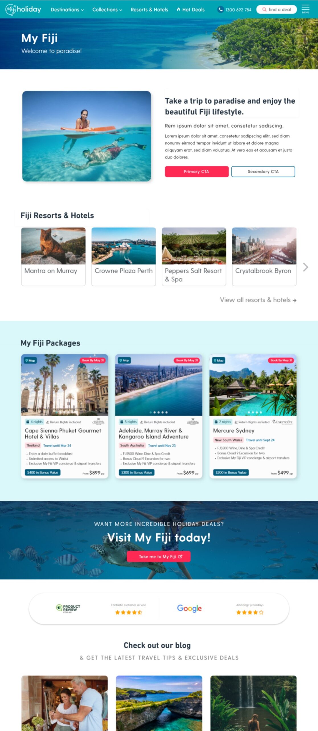
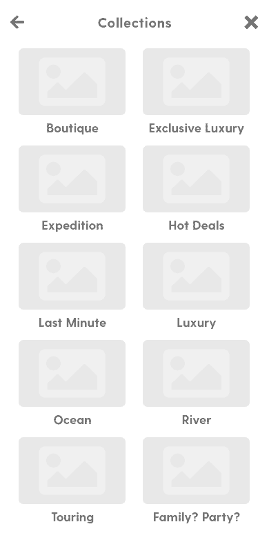
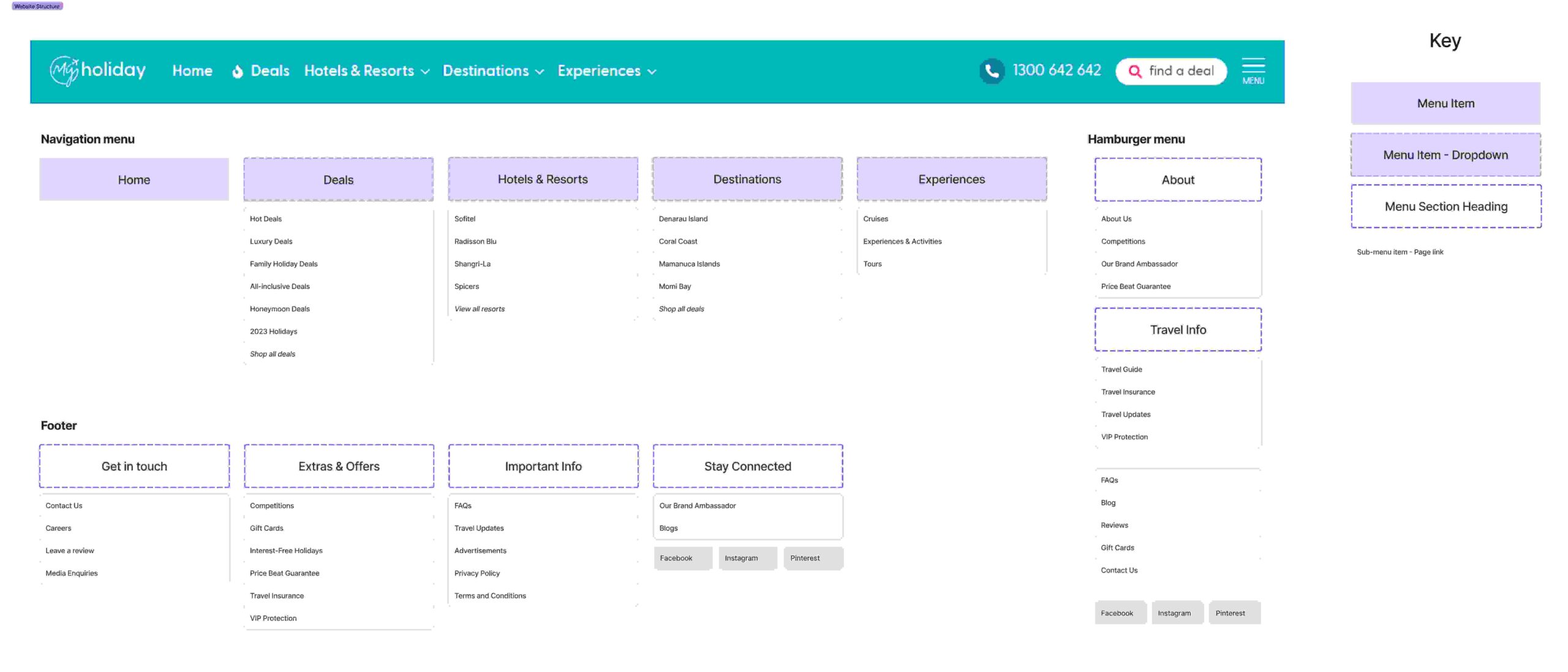
Menu & Search
A key challenge was building a more discoverable and user-friendly navigation system. I designed a persistent top-level menu to surface key categories and reduce reliance on the previously hidden mega-menu. Alongside this, I introduced a new package search tool to support users looking for specific destinations or inclusions. These changes were prototyped, tested, and refined based on feedback from both stakeholders and behavioural tracking data.
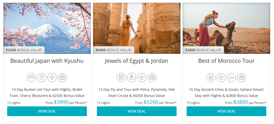
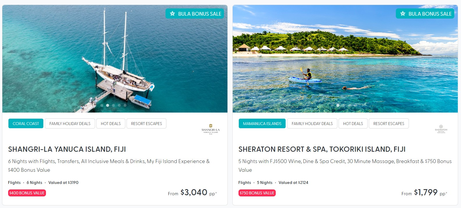
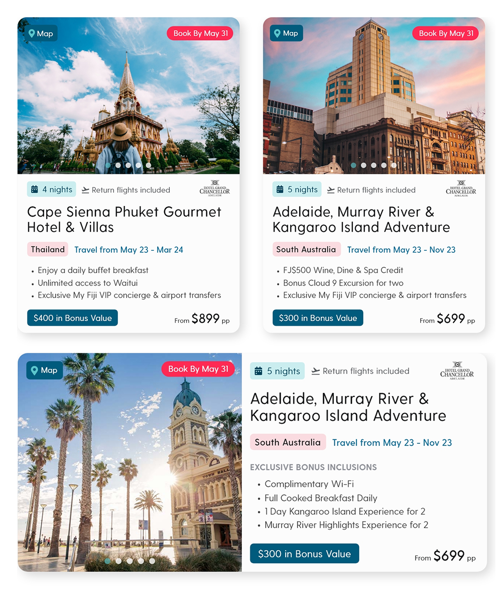
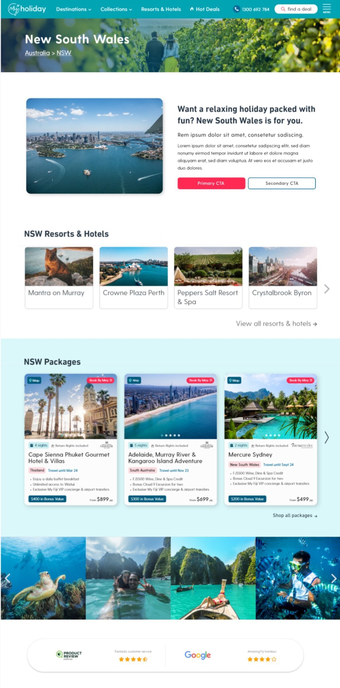
Product cards
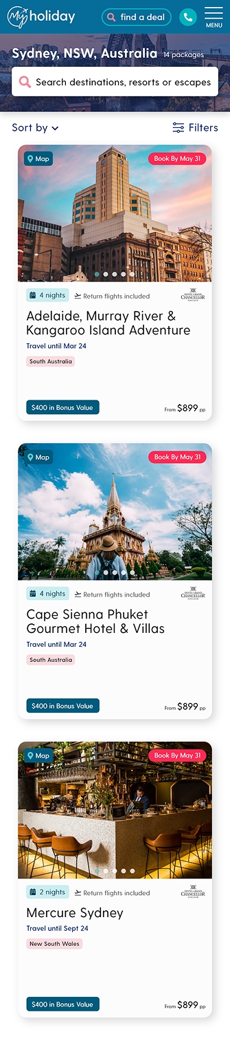
The original package cards were oversized, visually repetitive, and difficult to compare. I redesigned the card layout to make critical information – such as price, inclusions, and CTAs – easier to scan. I also introduced consistent formatting across the shop page to support browsing and comparison behaviours, particularly on mobile.
Images: Above – my new package card designs, left – old My Holiday package cards (top) and modular package cards (bottom).
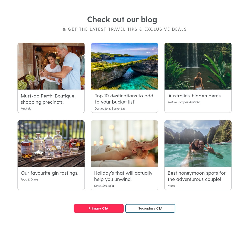
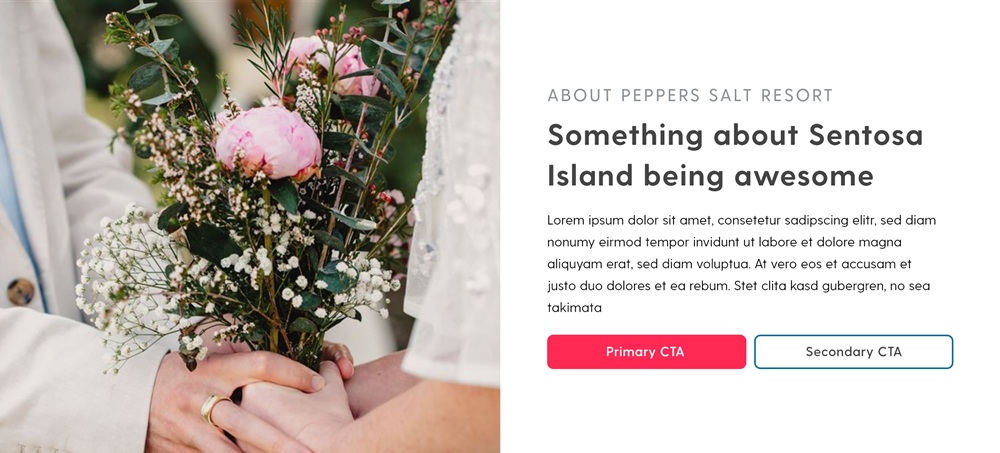
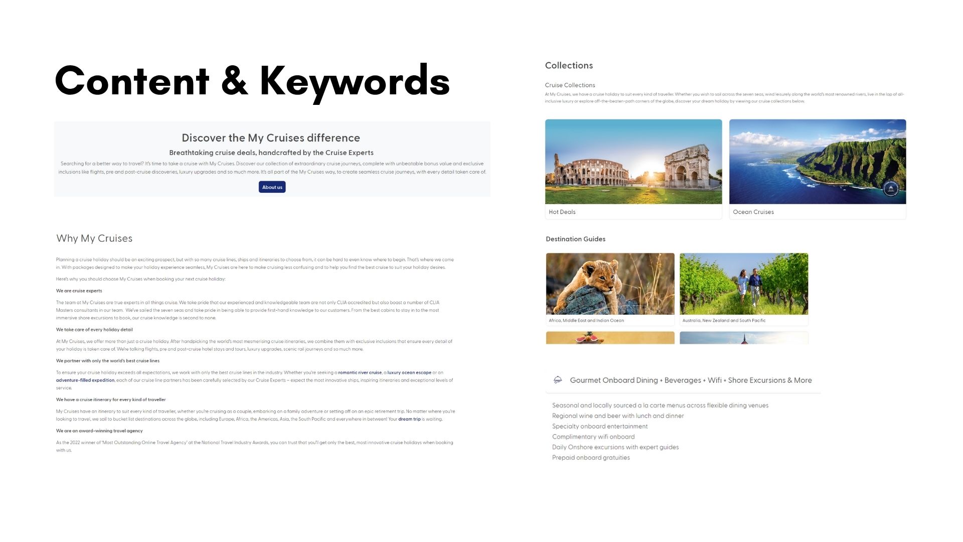
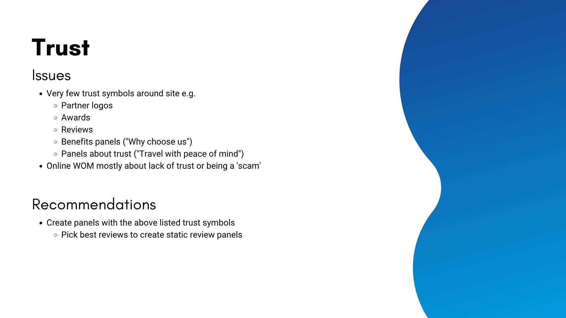
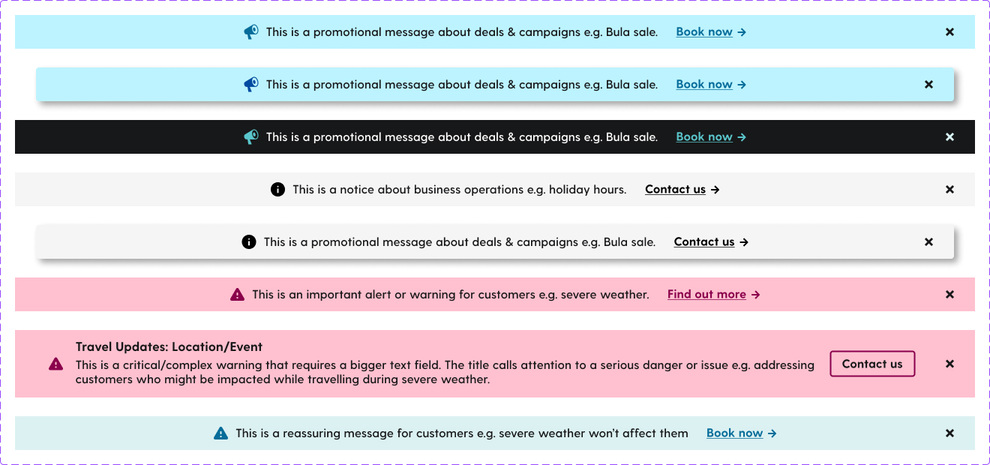
New Content Panels
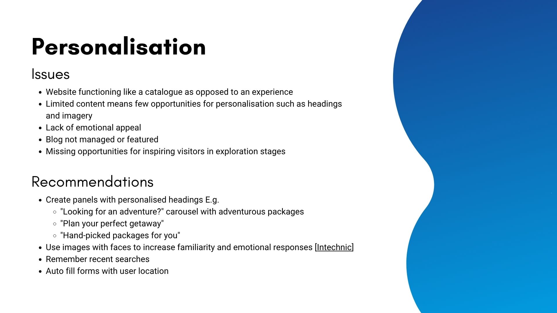
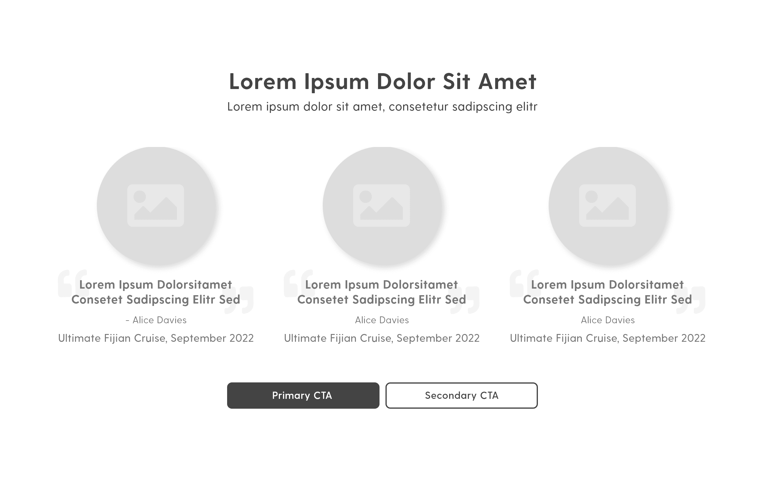
To build trust and support SEO, I created new content modules including “Why book with us?” panels, customer reviews, and support callouts. These elements were strategically placed across the homepage and internal pages to reinforce credibility and communicate the brand’s point of difference.
Images: Collection of screenshots from competitor websites, showcasing various features for inspiration. Organised on Notion.
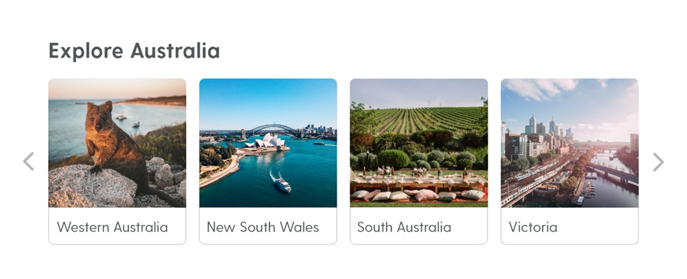
Page Templates
I redesigned the homepage and key internal pages with a focus on internal linking, content discoverability, and user engagement. Templates were developed to maintain consistency across the site and allow for scalable content updates. Each layout was tested for usability, accessibility, and visual clarity before being handed off to development.
Discussion
Twelve months after the redesign, the results demonstrated a clear shift in user behaviour and site performance. Conversions increased by 224%, confirming that improvements to navigation, search functionality, and content structure made it significantly easier for users to find and enquire about packages. Returning users rose by 77%, suggesting stronger brand engagement and a more compelling user journey. Sessions increased by 164%, with a 92% rise in engaged sessions and a 133% increase in average session duration – clear signs that users were not only arriving but staying longer and interacting more meaningfully with the site. Page views also grew by 92%, indicating improved internal linking and content discoverability. Together, these metrics reflect the success of a user-centred approach that balanced business goals with real usability improvements across the site.


